
A deep dive into the research journey and creation of a dashboard for the non-profit TCAPP to help with event planning.

ROLE
UI Designer
UX Researcher
SKILLS
User Research
Wireframes and Prototype
User testing
TIMELINE
Spring 2024
Background
TCAPP is a nonprofit that supports children and families that deal with chronic pain. Their goal is to provide access to education, validation, and support for families when dealing with chronic illness and the medical establishment.
The Problem…
I wanted to learn about what challenges are faced in putting on events so that we can understand what features are needed to make event planning run smoothly
DISCOVERY
Overview
I interviewed 1 event planner, 2 non-profit workers, and 2 people who used to work for non-profits about their successes and pain points when planning events.
Affinity Map

Observations
Many applications are used to organize important event planning information, but they are not interconnected, making sharing challenging.
While current processes work, a space where all critical information can be stored and shared would be beneficial and make event planning more efficient.
POV
As a non-profit volunteer, I want to have all my important documents/information stored in one area for easy access and communication.
HMW
How might we organize important information so it is easily accessible and understandable?
Persona
With the point of view in mind, I created a persona that plans events for TCAPP and seeks a dashboard that keeps all her essential information organized.
Yet, she struggles with not having all their information in one place and going from mobile to desktop because she is on the go frequently.

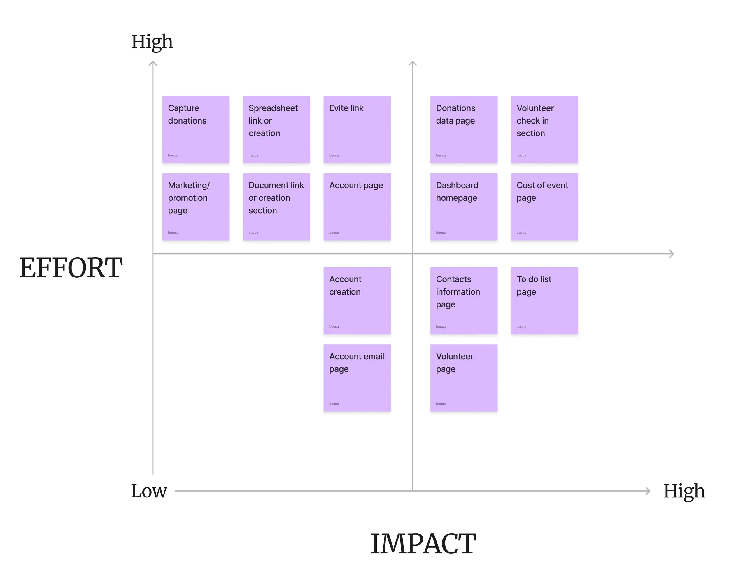
Feature Set
Rooted in research and persona insights, I pinpointed key features that delivered on both fronts: giving users a hub for all essential info while empowering the business to organize upcoming events seamlessly.
Must haves:
Dashboard homepage
To-do list page
Contact information page
Volunteer page
Nice to haves:
Donations data page
Cost of events page
Account email page
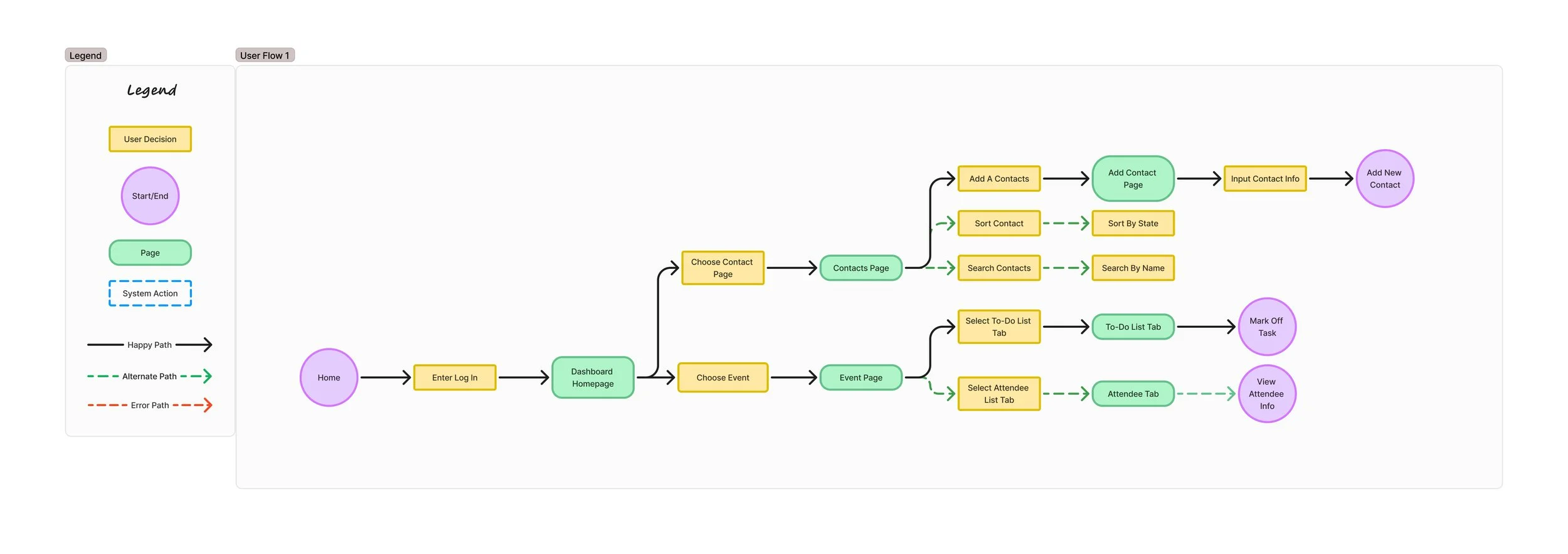
User Flow
With the must-have features and my user’s goal as my compass, I mapped out a user flow that shows how users navigate to the dashboard and add new contacts to their library, along with adding tasks to events.
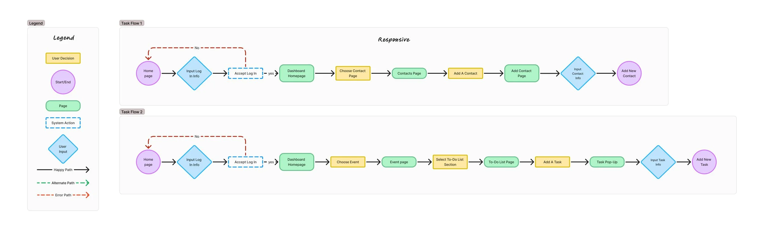
Task Flow
Building on the user flow, I developed detailed task flows to focus on key interactions. One flow traces the path from login to seamlessly adding a new contact to the library, while the other captures how a user logs in and quickly assigns to-do list tasks to specific events.
DESIGN
Low-Fi Wireframes
To begin with, I sketched out rough concepts of the key screens based on the task flow for adding a contact. I experimented with multiple layouts for the contact page and dashboard homepage, exploring what felt intuitive and straightforward, and then selected the strongest ideas to carry forward into the next stage.


Mid-Fi Wireframes
Next, I brought the strongest sketches to life in mid-fidelity frames, laying out each screen in the task flow sequence with clean placeholders and simple typography to focus purely on structure, flow, and usability.

User Testing
Round 1
With my wireframes ready to go, I tested them, running a desktop usability session with five participants to uncover any pain points. The feedback revealed two key areas needing improvement: the contacts page and the login section, which became priorities for iteration.
Problem #1: 3 out of 5 participants mentioned confusion about the contacts page already having a pre-selected contact and pop-up section active
Proposed solution: The rows would be extended with more information shown allowing the user to select the contact they wish to see
Problem #2 and 3: 3 out of 5 participants mentioned that the log in title and dashboard button were confusing
Proposed solutions: To change the button title to “log in”, swap the places of the log in button with the donate button since donate is of greater value, and change the label to “volunteer log in” to clarify the log in user

UI Elements
Before diving into high-fidelity design, I built a UI kit that blended existing components from the current website with fresh elements.
To maintain visual continuity, I carried over the original design’s soft, rounded edges, applying them across buttons, input fields, and content tiles to create a friendly, approachable interface.

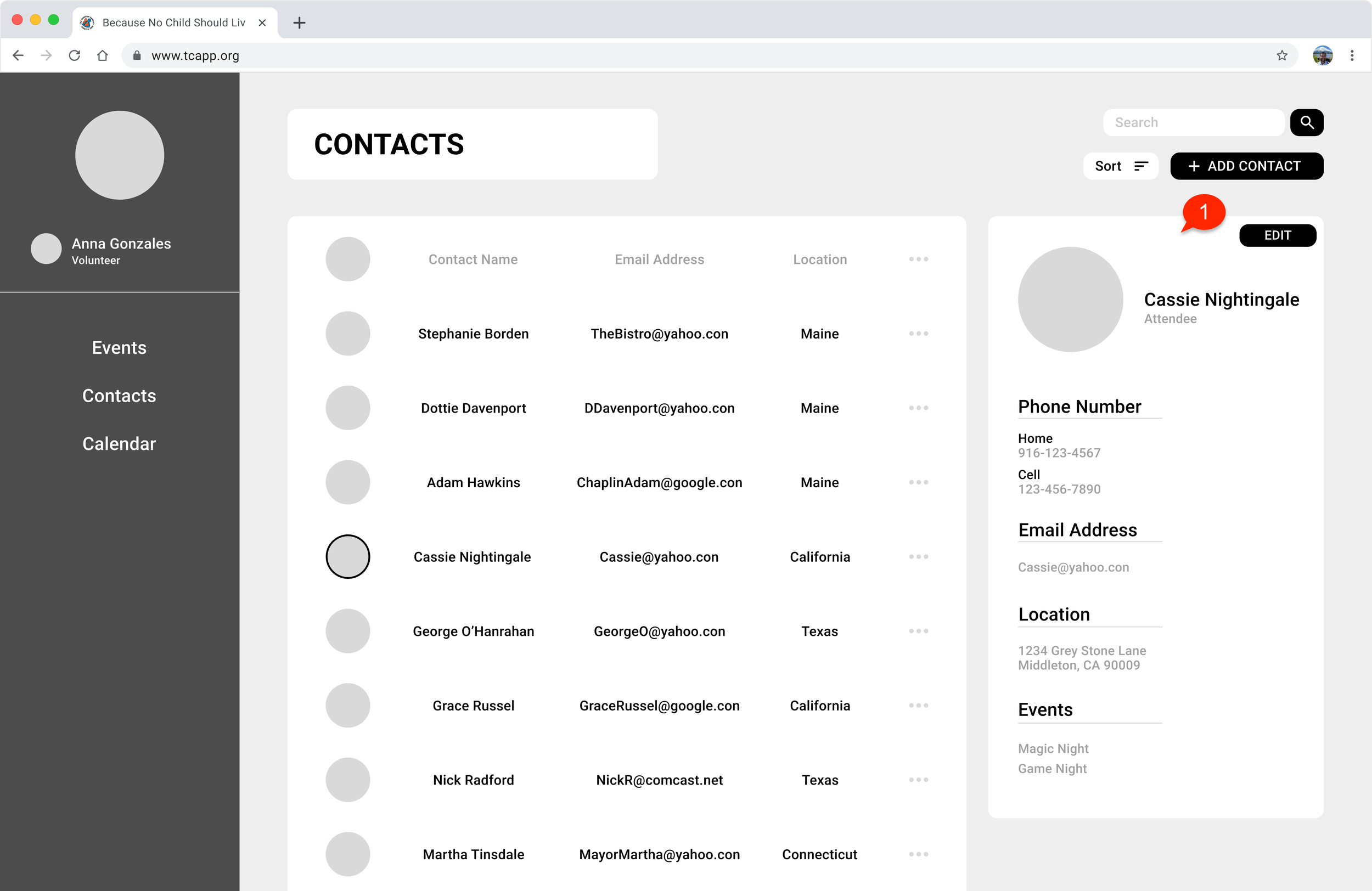
High-Fi Wireframes
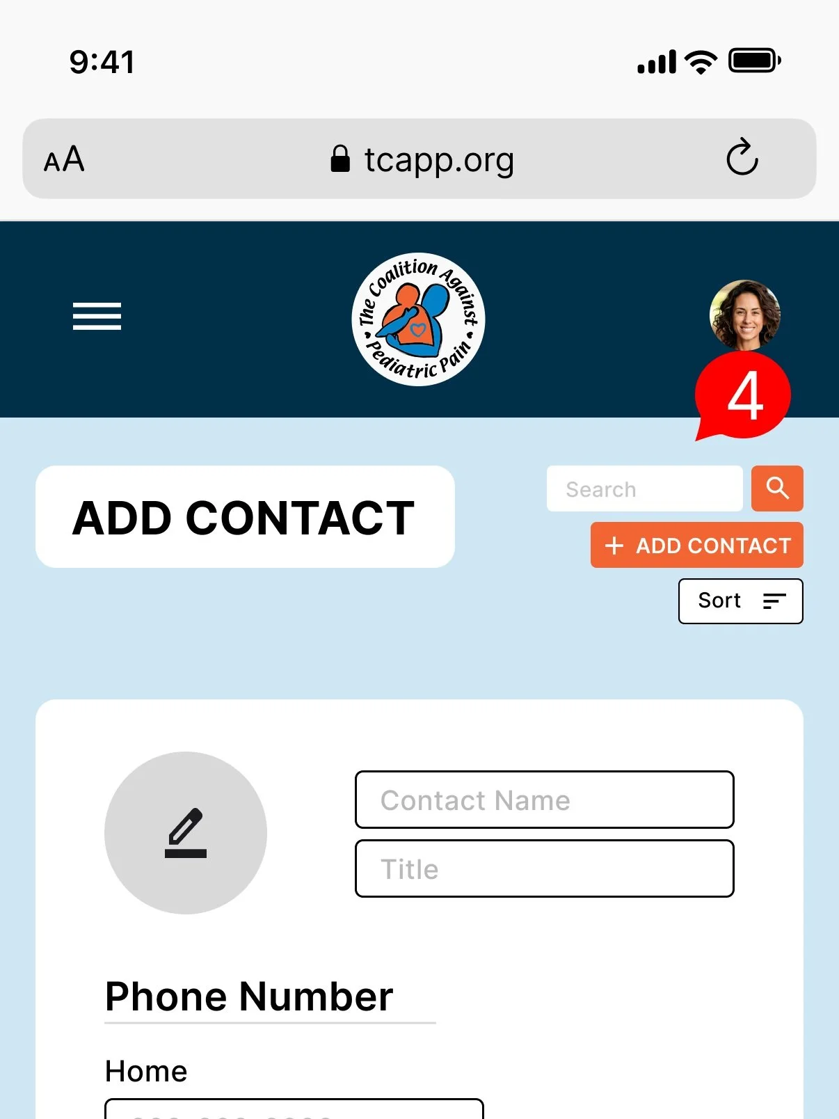
After reviewing user testing insights, I fine-tuned the wireframes, layered in the UI elements, and built a clickable prototype ready for the next round of feedback. I also designed a mobile version to ensure the experience was responsive and seamless across devices.
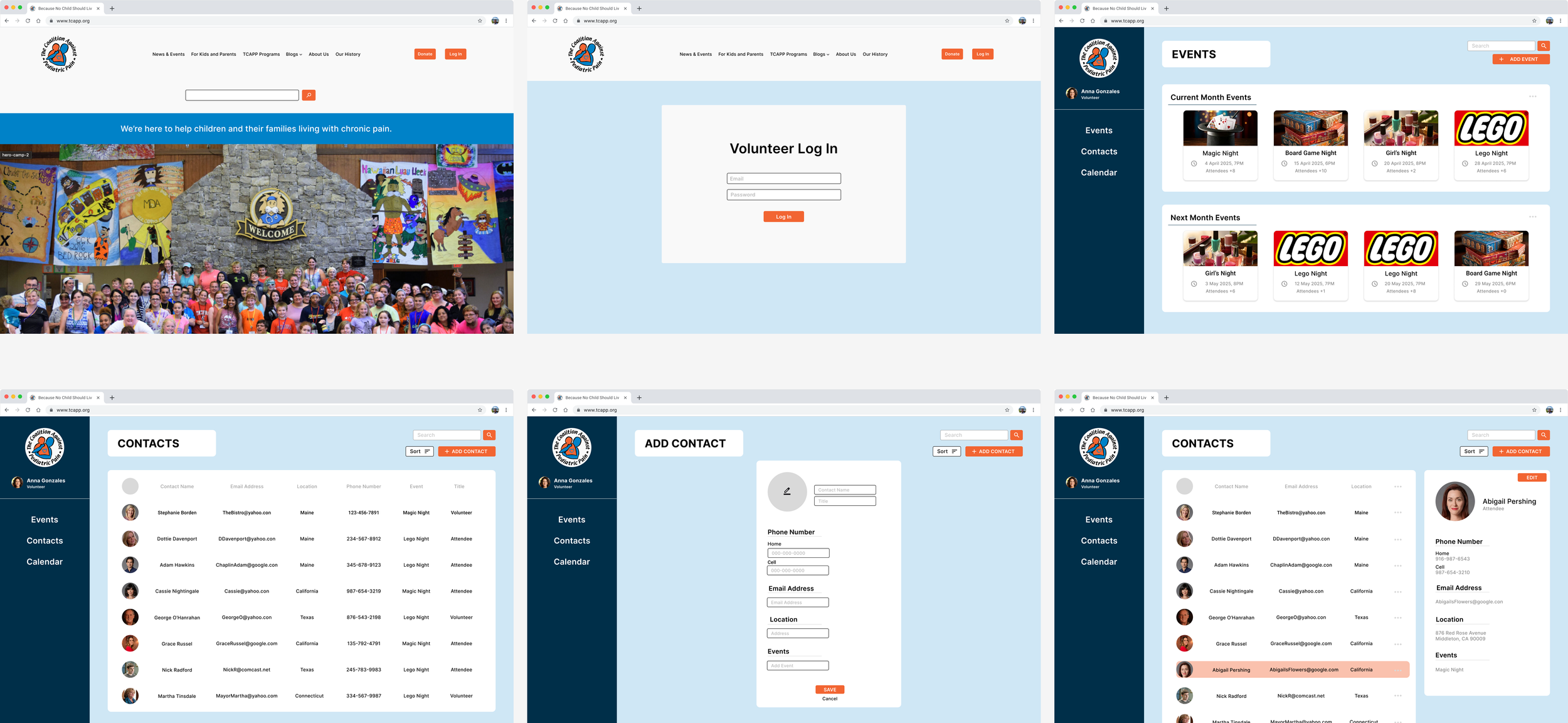
Desktop

Mobile
User Testing
Round 2
I tested the high-fidelity prototype with five participants on desktop and mobile, assessing its performance across screen sizes. The testing revealed two standout trouble spots, both rooted in the contact pages, signaling a clear next step for refinement.
Problem #1: 5:5 participants stated the grey area was confusing as it looked clickable or like an action area
Proposed solution: Change the font color to black and bold the text to convey that this area is for column headings and take away the grey circle icon

Problem #2: 3:5 participants said that there needs to be a way to exit the pop-up screen
Proposed solution: A small x will be added to the upper left hand corner of the pop-up contact section to indicate an exit
Problem #3: 2:5 participants commented that the sort button seemed cramped
Proposed solution: The sort button is moved down to be on top of the contact area across from a smaller section heading to help clean up the top button area

Problem #4: Comments on unnecessary buttons for this page that might cause confusion
Proposed solution: The search bar, the add a contact button, and a sort button are removed from the add contact page
Finalized Designs
After reflecting on the user feedback, I fine-tuned the designs one last time. The result? A sleek, streamlined prototype, both desktop and mobile, that is ready to move confidently into production.
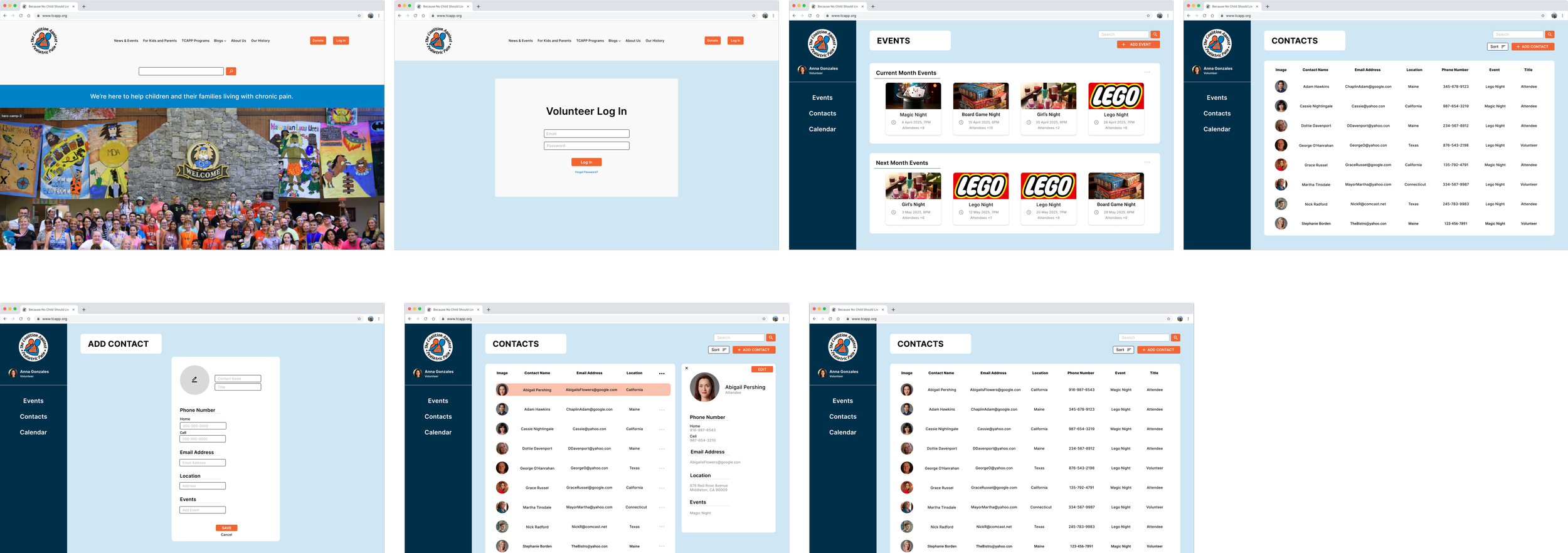
Desktop
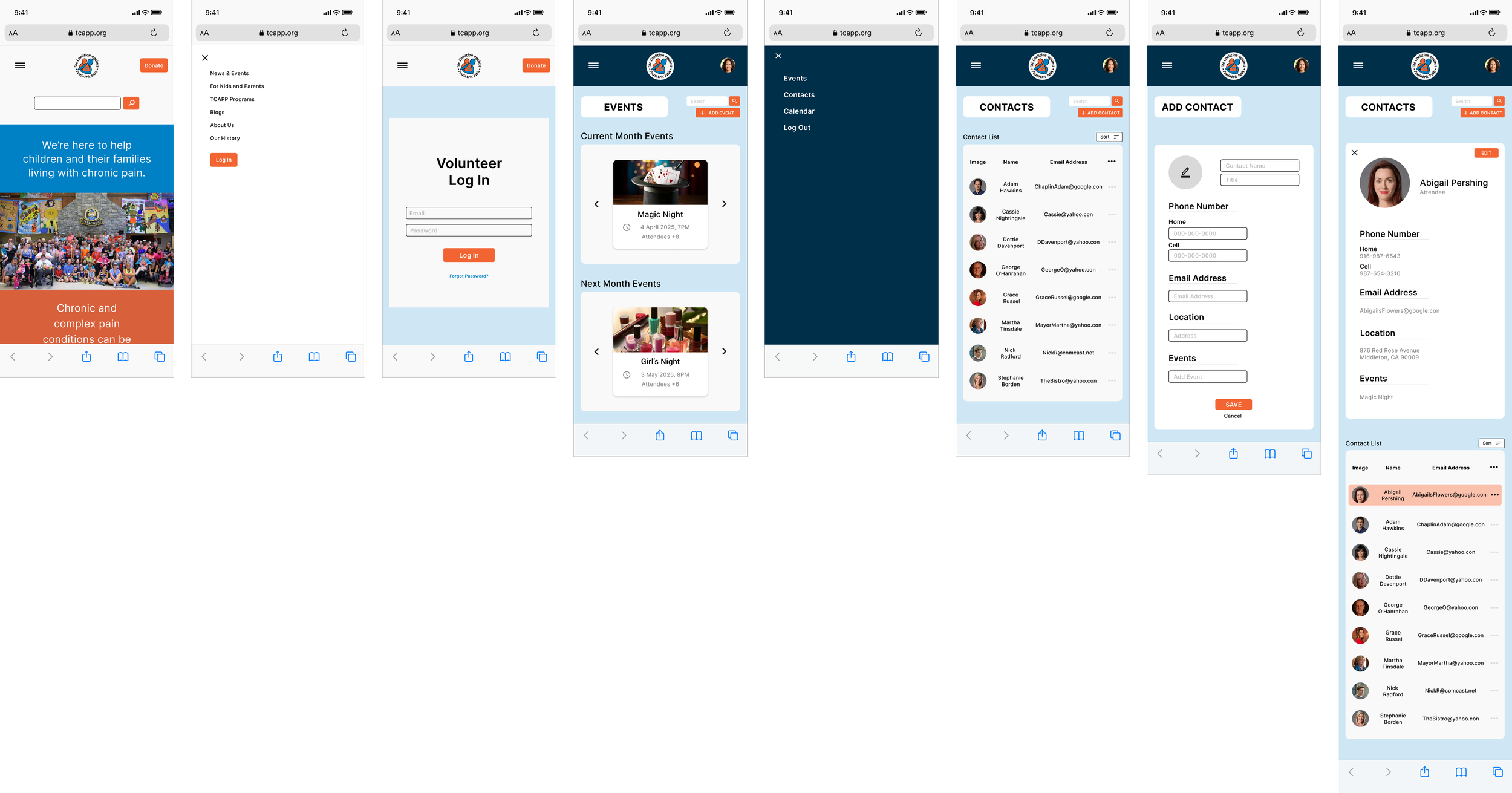
Mobile
Designs In Action
Here is a video of the prototype in action and click HERE to try the desktop prototype yourself!
Next Steps
After creating the prototype, the next steps that I would take are:
Create a task flow for the Add An Event
Create frames for the Add Tasks to specific events task flow
Create the calendar page
Sending off the UI Kit and flows to the software team to implement the feature on the site
What I Learned
During the research and design phases, I learned:
To design an internal-facing dashboard, which required a shift in UX priorities to focus on the employee mindset rather than external customers
To work with established branding, while introducing additons to improve functionality
How to balance aesthetics with simplicity, creating an interface that felt approachable and efficient for busy nonprofit staff