

A behind-the-scenes exploration of the research and development behind an app that empowers employees to select their own free swag.

ROLE
UX Researcher
Graphic Designer
UI Designer
SKILLS
User Research
Branding/Logo Design
Wireframes and Prototype
User testing
TIMELINE
Spring 2024
Background
Corporations give out free corporate swag to promote their brands and inspire employee pride. Many websites sell corporate swag, but it is for purchase only.
The Problem…
I wanted to learn about why people don’t use or like their free corporate swag, so that I could understand how to provide better swag options or platforms that are still of no cost to them.
DISCOVERY
Overview
I interviewed 2 corporate employees from large companies, 2 employees from small companies, and 1 significant other of an employee, who currently receives free swag.
Affinity Map
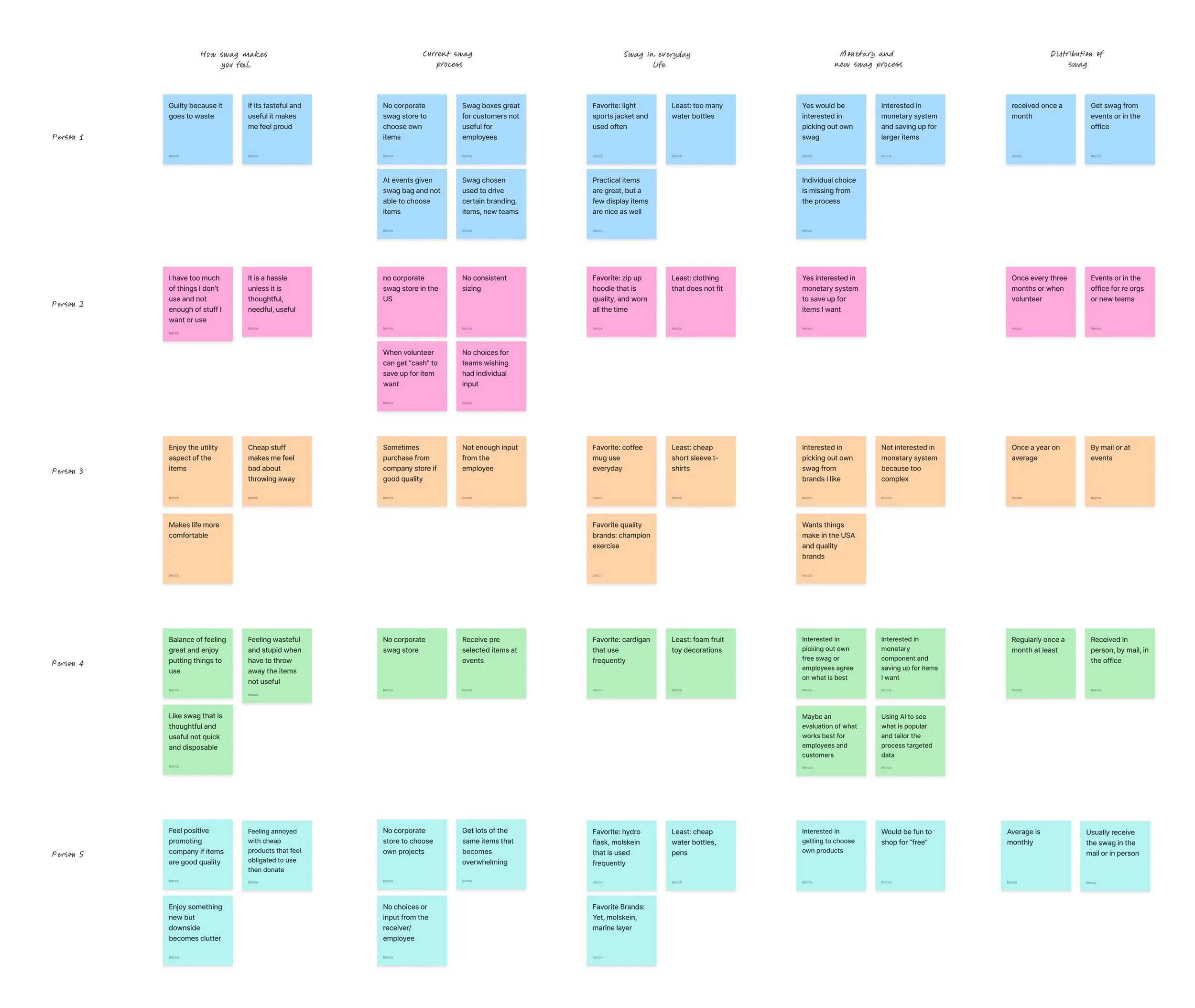
Observations
Users stated that swag comes to them without their knowledge or input
Users feel anxious and wasteful with swag that is not useful
Users were frustrated that their company does not have any swag for sale at a company store for purchase
POV
As a corporate employee, I want to have the freedom to choose my own free swag, so I am excited to promote my company and be more sustainable.
HMW
How might we create a system focused on the receiver’s choice for corporate free swag so the user feels excited to promote their company and we are more sustainable as a business?
Persona
I used the 'how might we' question to create an energetic employee persona who desires to choose their free swag through a quick and easy process.
Yet, he struggles with access to quality products and feeling wasteful, throwing away useless swag.

Feature Set
Grounded in research and aligned with my persona’s motivations, I selected features that struck a balance between delighting users with customizable swag options and meeting the business need to stay cost-effective compared to traditional methods.
Must haves:
Company specific homepage
Checkout page
Product categories menu
Nice to haves:
General homepage
Monetary bank section

Site Map
Recognizing the importance of a clear product category menu, I crafted a site map that thoughtfully organizes the swag offerings, making it easy for users to explore different options in an organized fashion.

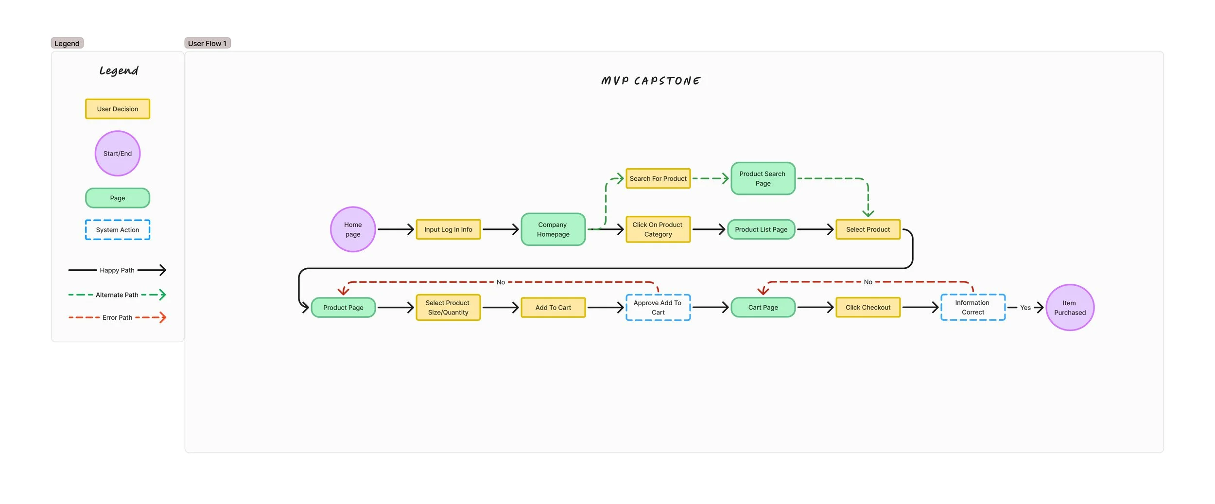
User Flow
Informed by the must-have features and site architecture, I crafted a journey that captures how users discover the company’s homepage, explore free swag offerings, and move effortlessly through the purchase process.
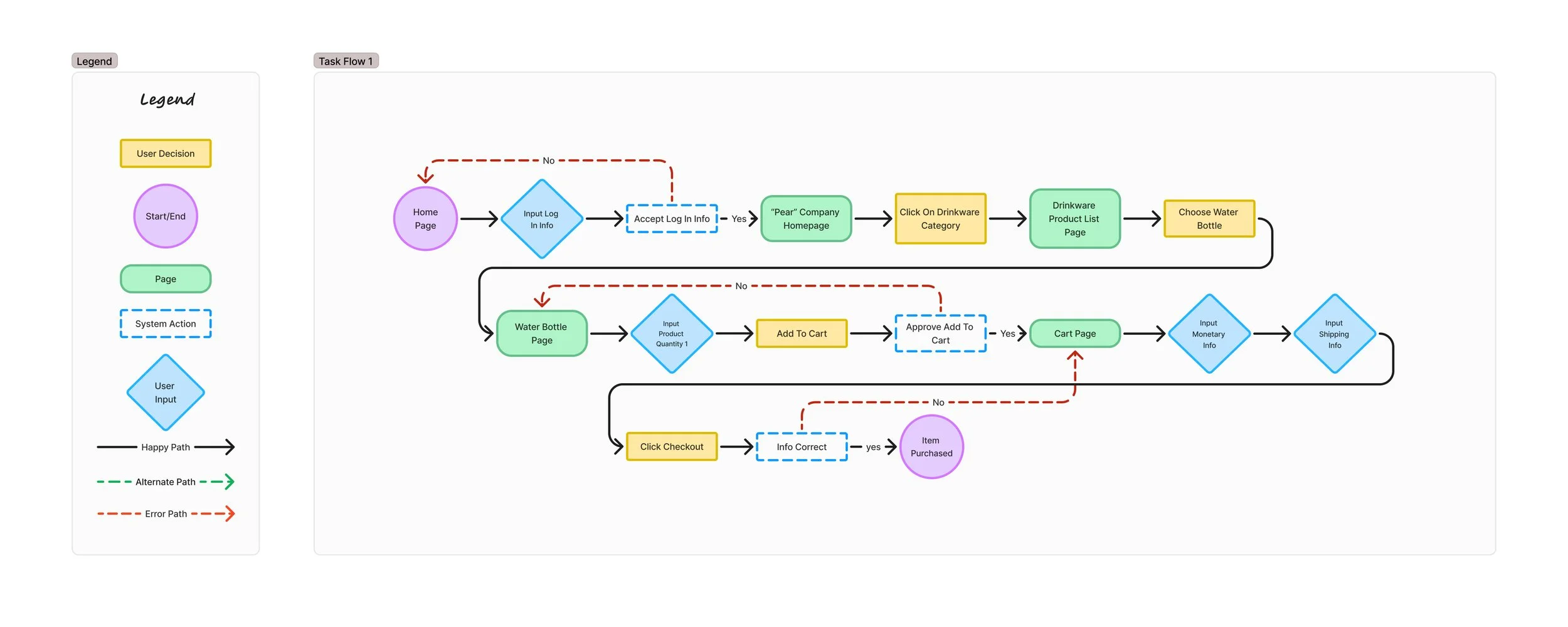
Task Flow
I zoomed into the user journey and mapped out a step-by-step task flow, starting with launching the app and logging in, then hunting down the perfect water bottle, putting it in the cart, and checking out.
DESIGN
Low-Fi Wireframes
Starting the design phase, I grabbed my sketchpad and roughed out key screens like the product category and cart pages, experimenting with multiple layouts. It was about quick exploration and picking the strongest concepts to flesh out in the next stage.


Mid-Fi Wireframes
With the winning sketches in hand, I created mid-fidelity wireframes to bring the experience to life. I prioritized usability from the start, fine-tuned the flow, and built out each step of the task like puzzle pieces coming together.

User Testing
Round 1
Once the wireframes were ready to go, I put the mobile app to the test, running the task flow by 5 users to see how it held up. Their feedback spotlighted four key problem areas, especially around the cart, navigation, and checkout pages—prime spots for improvement in the next iteration.
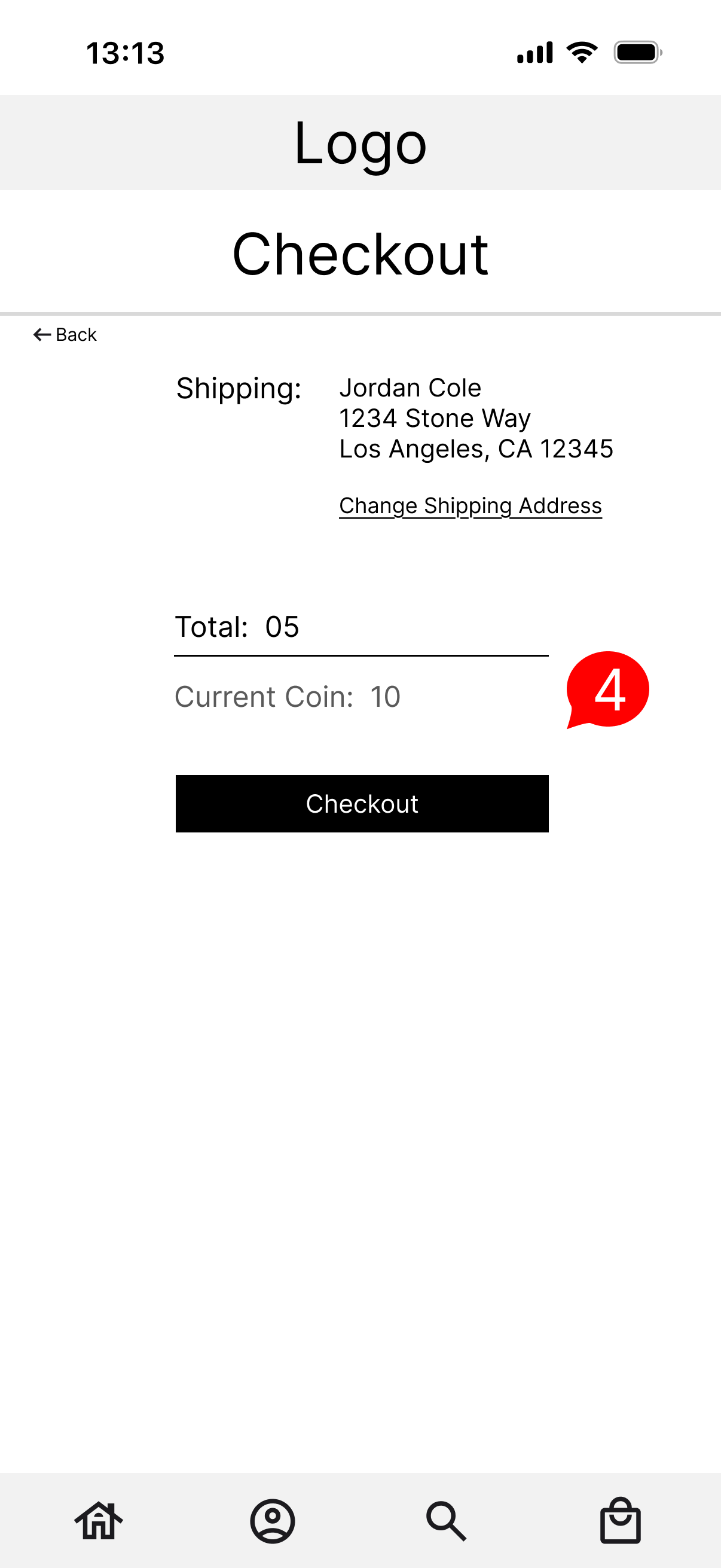
Problem #1: 5 out of 5 participants mentioned that they didn’t know that the ‘total’ referred to
Proposed solution: I would add the coin icon to the total to show that the total relates to the purchasing total

Problem #2: 3 out of 5 participants mentioned that there was an inconsistency in naming the page “my cart”
Proposed solution: I would change the title to “my bag” to be the same as the button on the previous page and the icon at the bottom being a bag
Problem #3: 4 out of 5 participants mentioned that the coin total should be shown in the footer
Proposed solution: I decided to create a coin icon and place it in the footer to show how many coins are left
Problem #4: 2 out of 5 participants mentioned that the checkout journey was confusing
Proposed solution: I decided to create a visual journey using icons to show where the user is in the checkout process
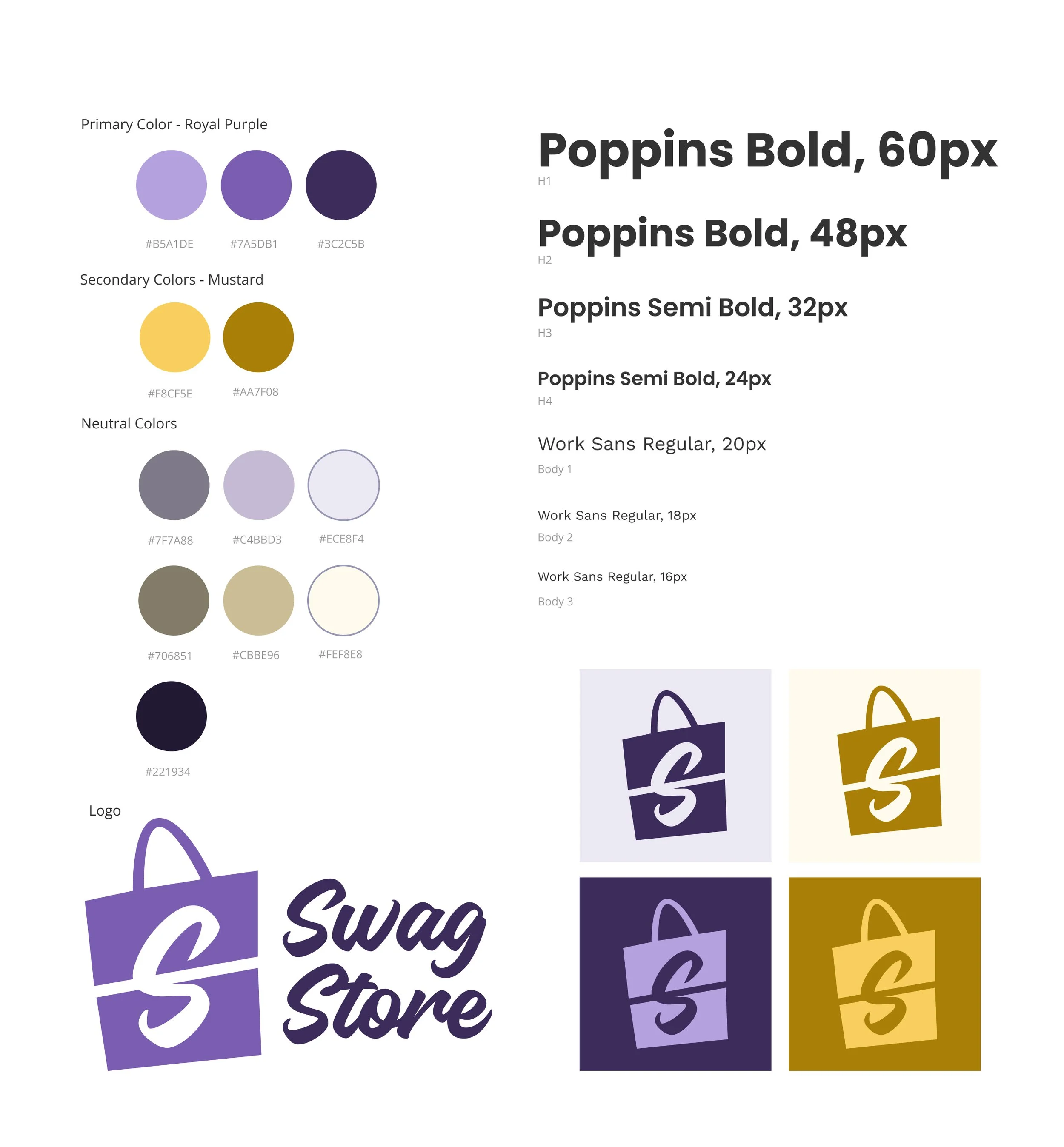
Style Tile
Inspired by the brand’s core values and my persona’s goals, I designed a logo bursting with motion. A swooshing 'S' is cleverly fused with a shopping bag to capture both energy and purpose.
For the color palette, I paired a rich purple for a touch of sophistication with a bright yellow to spark joy and vitality.
To tie it all together, I chose a crisp, upbeat, and easy-to-read typeface, even when tiny.
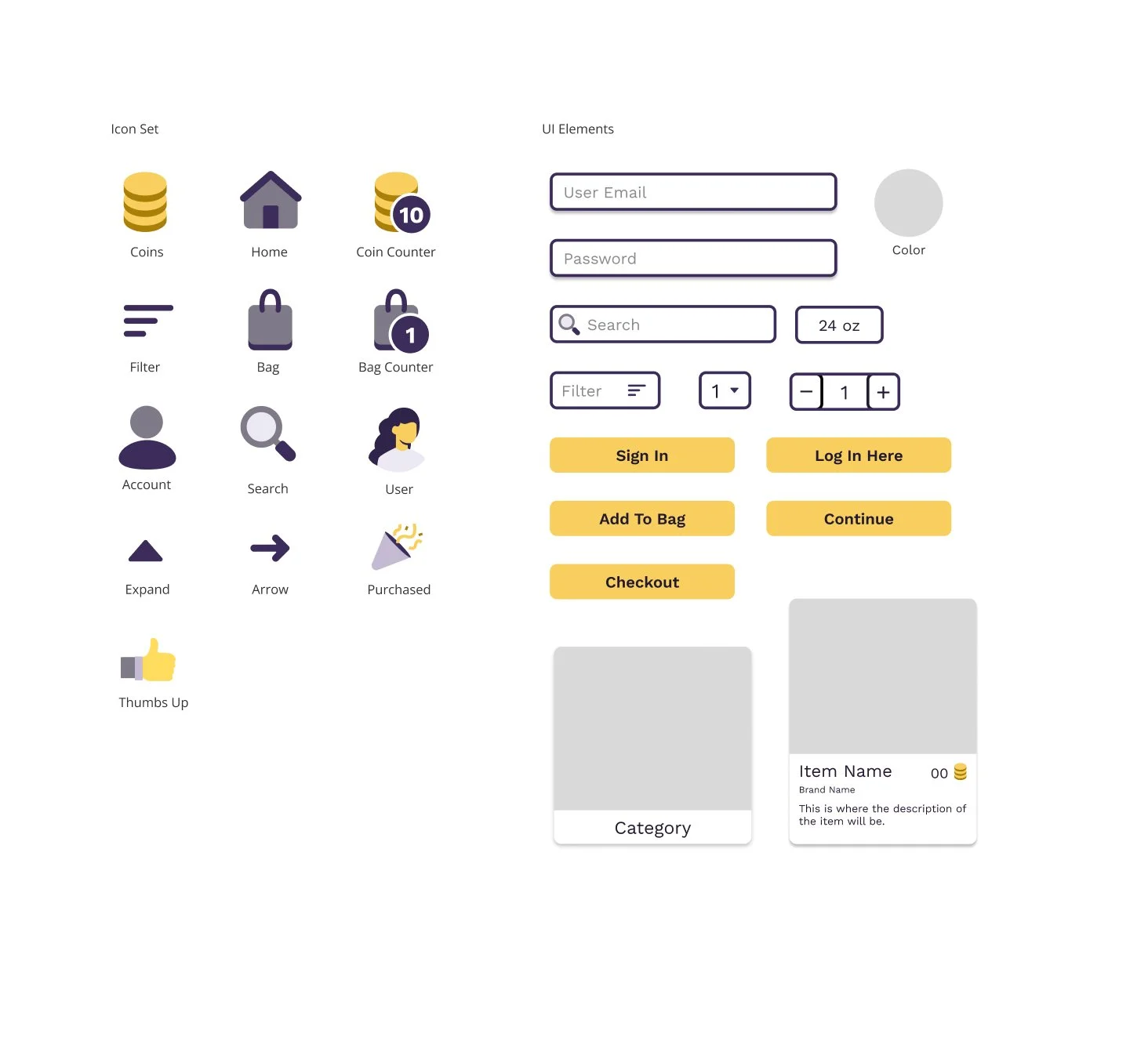
UI Elements
Before diving into high-fidelity designs, I crafted a UI kit to bring the style tile to life, translating the visual identity into reusable components.
I used vibrant yellow for call-to-action buttons to spark joy and grab the user’s attention, along with sleek, unlined icons to add a modern and professional touch.
High-Fi Wireframes
With my freshly built UI kit and insights from round one of user testing in tow, I brought the vision to life in high-fidelity designs. Every screen was polished with refined, clickable images and icons ready for users to test once again.

User Testing
Round 2
Next up: user testing, round two! I handed the mobile app prototype to five fresh users and watched them dive in. Their journeys uncovered four key trouble spots: navigation, the item detail page, and the 'My Bag' experience, each one a golden opportunity for refinement.
Problem #1: 5:5 participants said the continue button name was confusing and needs to be changed
Proposed solution: I changed the name to checkout which related to the next page in the checkout journey

Problem #2: 4:5 participants said that the continue button being at the top of the page was confusing
Proposed solution: Move the continue button to the bottom of the page to be in the same place as the following pages buttons
Problem #3: 4:5 participants commented that the icon placement was confusing
Proposed solution: I chose to put the coin icon in the top right section of the header since that is the area users look at first, along with moving the user icon to the left area of the header

Problem #4: 4:5 participants felt clicking the item size as a button was an unnecessary step
Proposed solution: I chose to eliminate the size as a button if the item has only one size, instead just having the size as plain text
Finalized Designs

After digging into user feedback, I rolled up my sleeves for one last round of iterations, fine-tuning every detail to craft finalized designs and a prototype that’s polished, pixel-perfect, and ready to head into production.
Designs In Action
Here is a video of the prototype in action
Click HERE to experience the prototype yourself! (best viewed on Figma mobile app or laptop browser)
Next Steps
After creating the prototype, the next steps that I would take are:
Work on developing the account page that describes the coin process and how many coins the user has
Create the search page and active filter button
Create a task flow for adding multiple items to the cart
Send the UI kit and details to the software team that creates the app
What I Learned
During the research and design phases, I learned:
How in designing for mobile-first, there are different UI patterns and iconography that work better in smaller formats
How users rely on visuals during the checkout process and how button wording directly affects a user’s confidence in the action
How to place critical information where users instinctively look first, reducing confusion during testing