
A behind-the-scenes look at the research journey and creation of a feature for the fashion brand website Kate Spade that helps with outfit inspiration.

ROLE
UI Designer
UX Researcher
SKILLS
User Research
Wireframes and Prototype
User testing
TIMELINE
Spring 2024
Background
Kate Spade is a global lifestyle brand encompassing handbags, jewelry, shoes, and clothing. Despite the main page promoting new items, no feature shows outfit inspirations with multiple items.
The Problem…
I wanted to learn about what inspires current customer purchases so that we understand how to encourage multiple-unit purchases.
DISCOVERY
Overview
I interviewed 5 online shoppers who frequently visit luxury fashion websites like Kate Spade to understand their experiences, challenges, and successes in discovering new items and purchasing outfits.
Affinity Map
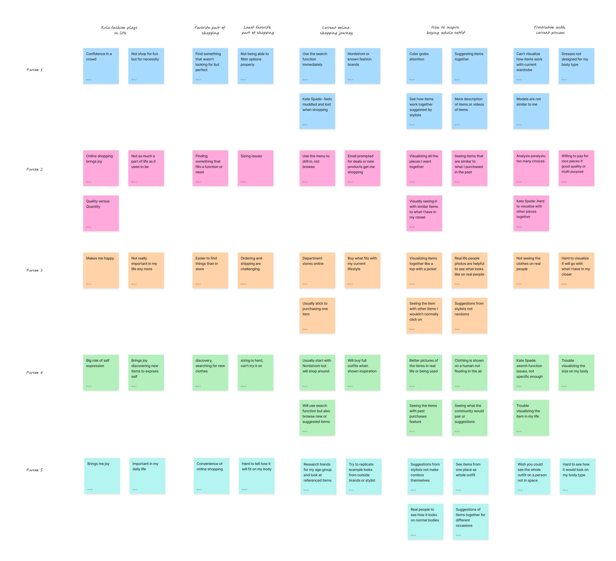
Observations
People are more likely to purchase multiple units if they see the items displayed together, like on a mannequin.
Users are interested in stylist suggestions on collections, not creating collections themselves.
Users want models that are closer to their body shape to visualize the clothing on.
POV
As a fashion lover, I want to see items paired together as outfit suggestions because I want to find a new outfit.
HMW
How might we create a feature suggesting outfits by stylists to inspire users to purchase the whole look?
Persona
Going off the how might we question, I created a fashionista persona wishing to see outfit suggestions to inspire new purchases and display them for her body type.
Yet, she struggles with discovering items that work together without suggestions and visualizing them in real life.

Feature Set
Drawing from user research and persona insights, I identified key features that help users easily find items that work together as an outfit while supporting the business goal of boosting multi-item purchases.
Must haves:
Dedicated suggestions section
Suggestions for different occasions
AI human model
Nice to haves:
Checkout for outfit suggestions
Pop-up for how to buy items

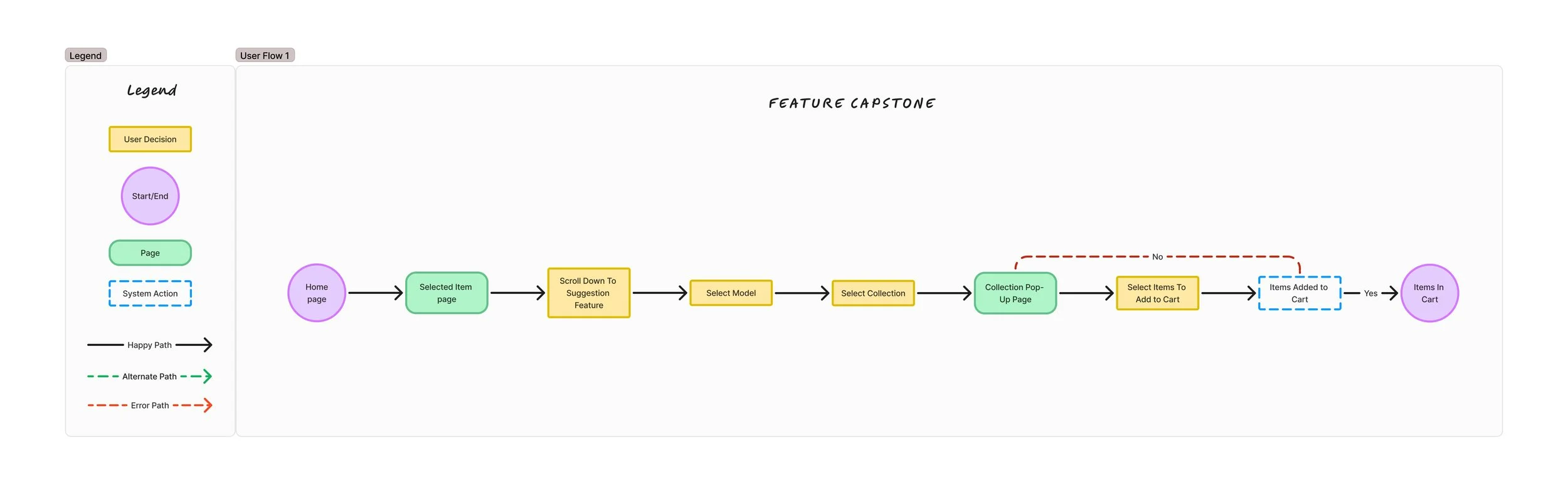
User Flow
With the key features in place, I crafted a user journey that illustrates how a shopper seamlessly discovers complementary items for a selected shirt and adds them to their cart, showcasing how inspiration leads to purchasing.
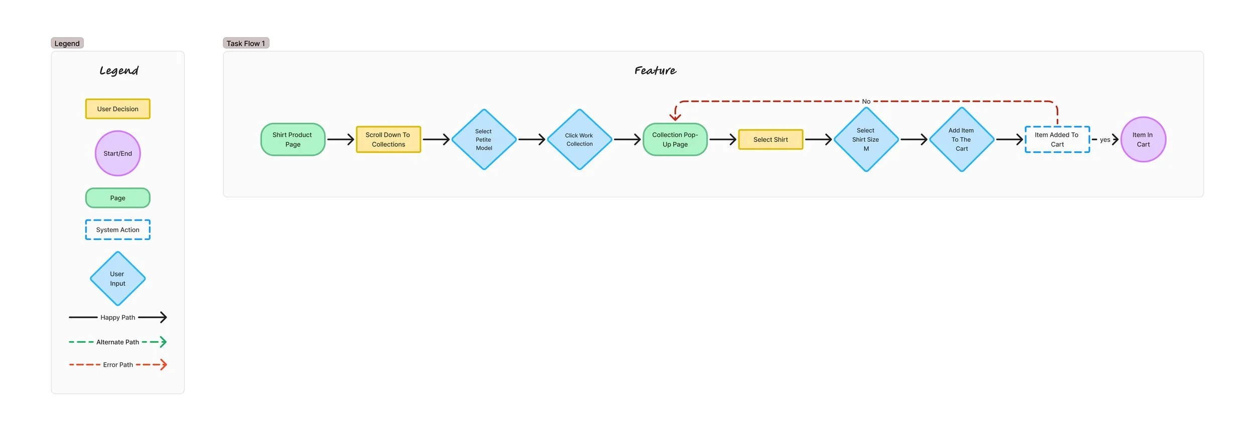
Task Flow
I translated the user journey into a detailed task flow that captures each step: from scrolling to discover the feature, selecting a model, choosing a work-inspired outfit image, to browsing matching items and ultimately purchasing a shirt in size large.
This flow showcases a smooth, intuitive path from inspiration to conversion.
DESIGN
Low-Fi Wireframes
To kick off the design phase, I sketched rough drafts of the main screens based on the defined task flow. I explored multiple variations of the key feature page and its pop-up interaction, ultimately selecting the most effective layout that also translates well into the current website design.


Mid-Fi Wireframes
Next, I refined the strongest page designs into mid-fidelity wireframes, using clean layouts, simple typography, and placeholders for images to focus on structure and usability. These pieces were then integrated into the existing webpage to test functionality and ensure a seamless user experience.

User Testing
Round 1
With the wireframes in place, I conducted desktop-based usability testing with five participants to evaluate the task flow in action. After analyzing the feedback, two key pain points emerged that needed iteration.
Problem #1: 5 out of 5 participants mentioned that the title of the feature was confusing
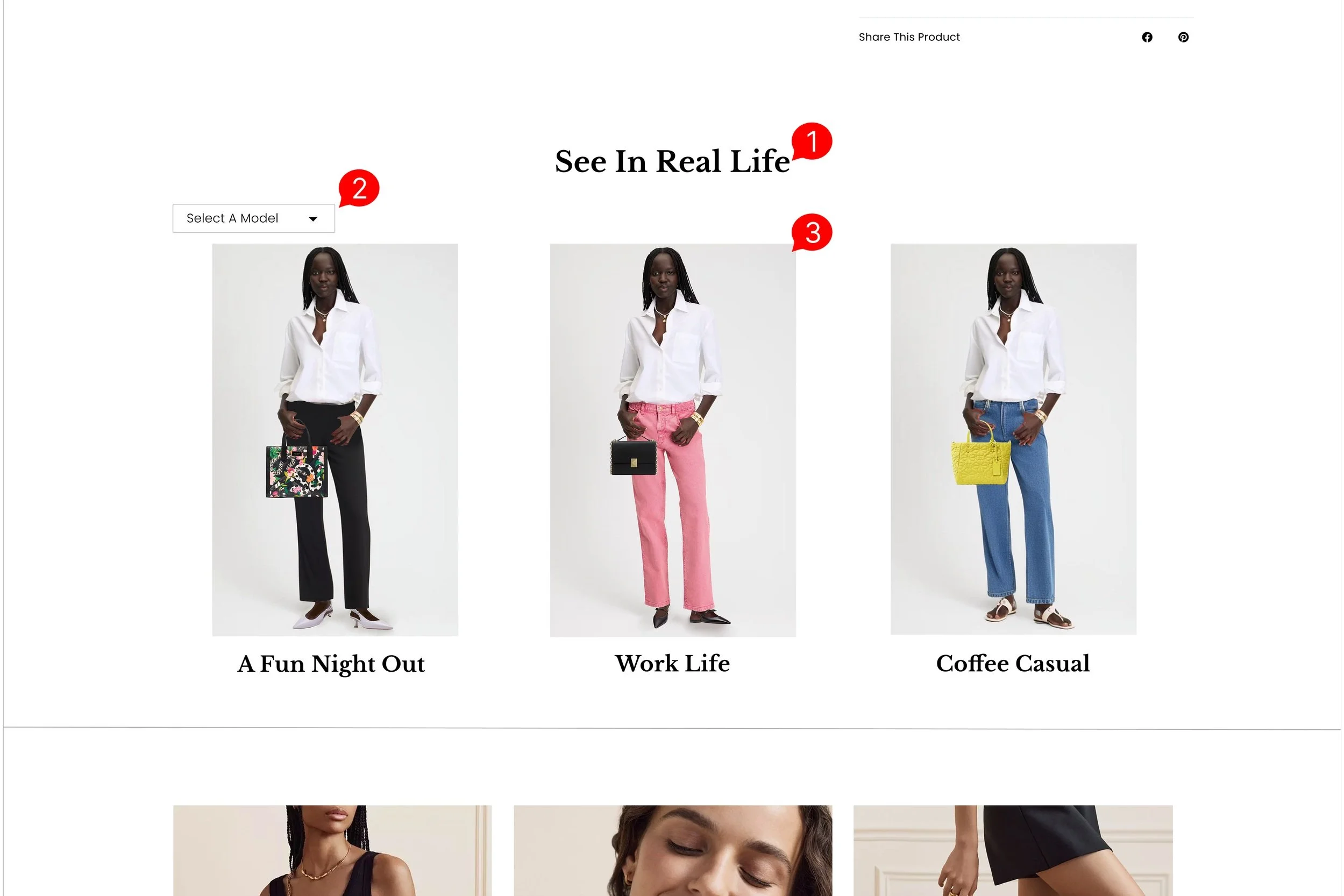
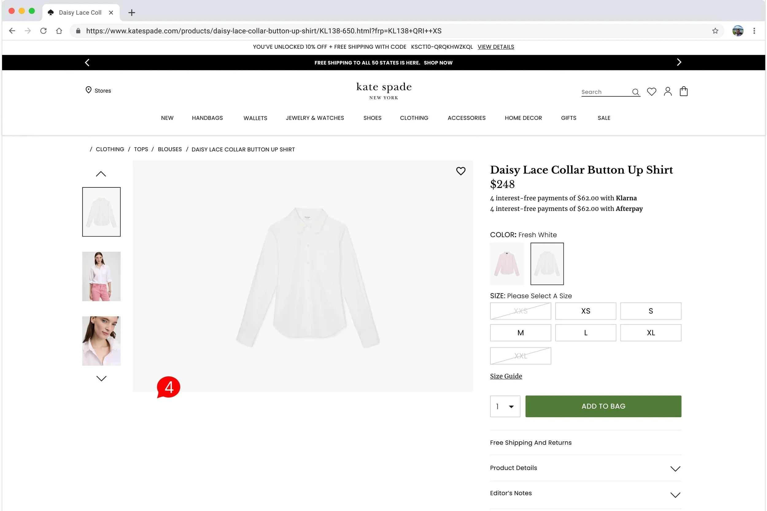
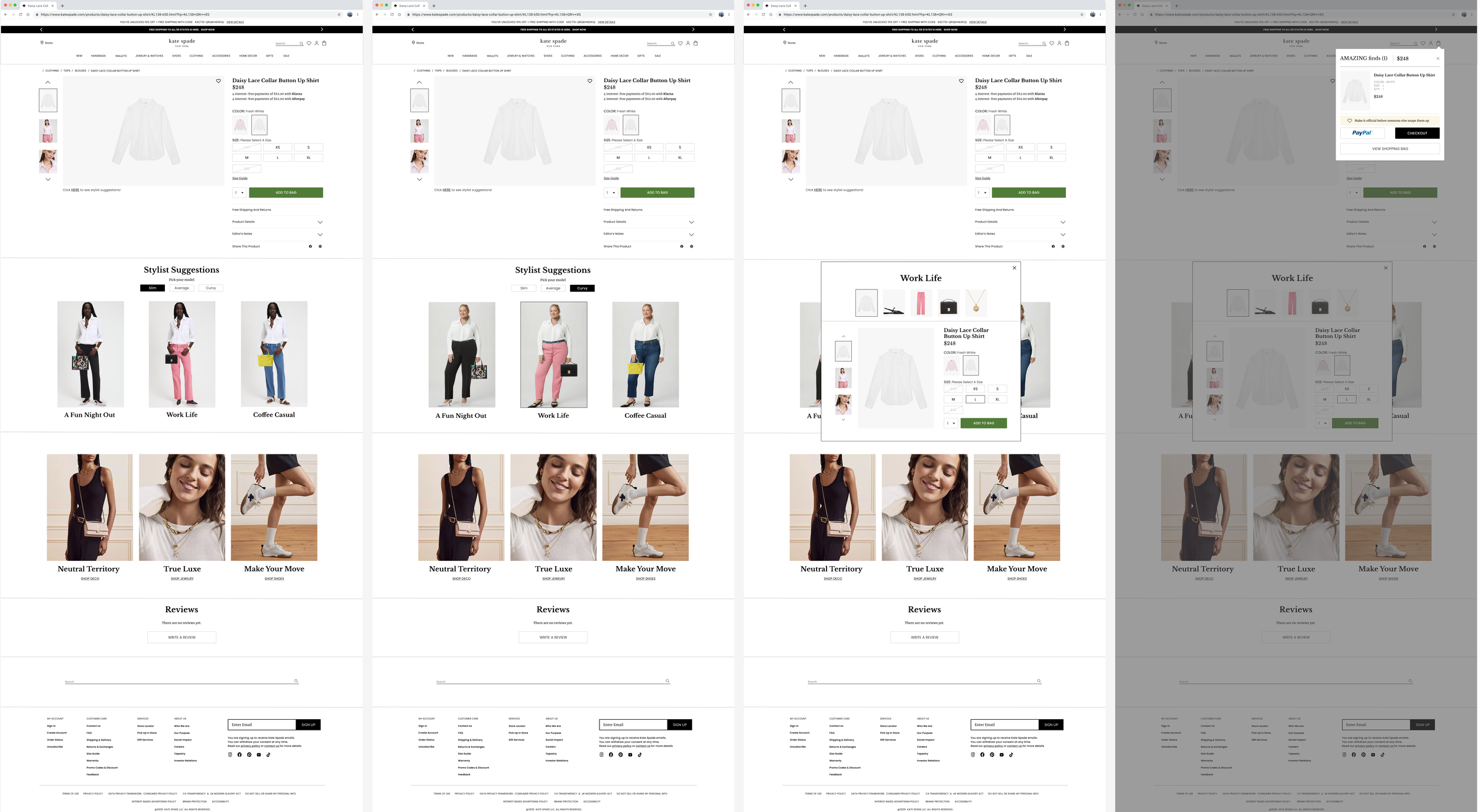
Proposed solution: After some iterations, I decided to change the title to “See In Real Life” to describe how the collection shows the item as a whole outfit in real-life situations

Problem #2: 3 out of 5 participants mentioned that extra images of the selected are missing on the left-hand side
Proposed solution: Since the original page has other images of the selected item in a vertical carousel format I would implement the same format in the pop-up

UI Elements
Before moving into high-fidelity designs, I developed a cohesive UI kit that blends existing components from the current website with newly designed elements that matched its visual style. This ensures consistency while allowing for fresh, feature-specific additions.

High-Fi Wireframes
Informed by UI elements and insights from the first round of testing, I brought the design to life with a high-fidelity prototype, refining visuals and interactions in preparation for the next round of user testing.

User Testing
Round 2
For the second round of user testing, I observed five participants interacting with the desktop version of the product. I identified four key areas for improvement that will guide the iterations for a final prototype.
Problem #1: 3:5 participants stated the title did not convey what the feature was
Proposed solution: Change the title to “Stylist Suggestions” to better convey how the feature suggests outfits curated by stylists
Problem #2: 3:5 participants felt the menu was hidden and hard to find
Proposed solution: The menu will be placed in the center of the screen for better visibility, and changed to button that are more bold and visually interactive
Problem #3: 4:5 participants said they didn’t realize the Work Life image was clickable
Proposed solution: There will be a hover-over state that creates a black border around the image, showing that it is interactive and clickable
Problem #4: 3:5 participants said the feature was hard to find because there was no signifier “above the fold”
Proposed solution: Text was put under the main item image “above the fold,” which is clickable and jumps to the feature
Finalized Designs
Guided by user feedback, I honed the design into a polished, high-fidelity design and a prototype to be fully equipped and ready to transition into the production phase.
Designs In Action
Here is a video of the prototype in action and click HERE to experience the feature yourself!
Next Steps
After creating the prototype, the next steps that I would take are:
Creating a more in depth pop-up page where all items are selectable
Creating pop-up pages for the other outfit suggestions
Creating a task flow of adding multiple items to the cart from the pop-up page
Sending off the UI Kit and flows to the software team to implement the feature on the site
What I Learned
During the research and design phases, I learned:
More about consumer-user behavior, especially how the right visuals can encourage more purchases
How to balance functional UI elements with an appealing form, especially when integrating those elements into an existing brand
Discovered the importance of strategic placement, spatially and in the user journey, to ensure a feature is seen and used